


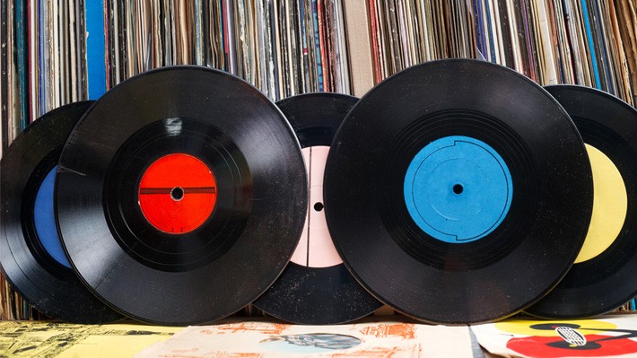
If you love your music, you’ll know all about the vinyl revival – but you might be surprised to hear that 48% of the people buying vinyl never actually listen to it. They aren’t buying records for richer sound or a full album experience; they’re buying them for the full-size cover art. And there’s a lesson in there for B2B content marketing.
Think about the albums that have been the soundtrack for your life – and you won’t be able to separate them from the image on the cover. Would Sergeant Pepper, Nevermind or London Calling sound the same without the images planted in your head of fluorescent uniforms, floating babies and smashing guitars? How about the banana pop art that launched The Velvet Underground or iconic black album covers from AC:DC and Metallica?
Great cover art never just describes what you’re going to hear; it complements it and commentates on it. It’s a creative statement in its own right that engages on its own terms, but also adds to your appreciation of the content within. It helps sell the album – but that’s only part of the story. It intrigues, demands attention and changes the way that you listen. It markets the content within, but it’s also content in its own right.
Iconic albums just wouldn’t be as iconic if the brief for the cover art went something like: make sure it looks like all the other albums and that everyone can see the name and title. It’s the individuality and unpredictability of cover art that gives it its value. As music lovers that’s what we appreciate about it – but as content creators, in B2B content marketing in particular, we’re often reluctant to apply the same principles to our own content.
Imagine if, rather than finding a loosely related stock photo and matching it with your brand logo, the cover for your next content asset followed the classic album route. Here are some of the principles that you might apply:
Intrigue the heck out of people
Why are those naked women crawling over the Giant’s Causeway? Why is that man calmly shaking hands with someone on fire? Why a banana? Those are the immediate questions that spring to mind when you glance at the covers of Houses of the Holy (Led Zeppelin), Wish you were Here (Pink Floyd) and The Velvet Underground. They are the type of questions that could kill a creative concept stone dead in plenty of B2B marketing ideas meetings – because the implication is that these images have no logic, make no sense, and are therefore wrong. However, a reaction like that misses the point of cover art. These images have created such iconic album covers precisely because they make no immediate sense.
There’s a fascinating concept in neuroscience known as The Zeigarnik Effect. It refers to the fact that we remember uncompleted tasks much better than completed ones, which our brains can file away before happily moving onto the next thing. And it’s got big implications for the way we respond to imagery. If an image (or an album cover) doesn’t make immediate sense, if your brain can’t complete the task of decoding it, then it engages your attention and sticks in the mind far more effectively.
Communicate attitude and emotion
The reason so many album covers are so bizarre is that they focus less on communicating rational ideas – and more on communicating the emotional experience that’s associated with the music. Heavy Metal covers excel at this – all those threatening Iron Maiden illustrations, or the outlaw imagery on the cover of Motorhead’s Ace of Spades. However, every great album cover riffs on the attitude it supports or the emotion it promises you. How about the image of Bjork on the cover of Debut – simple, elfin, vulnerable but magical at the same time? That spooky desperation on Lana del Ray’s face for Born to Die? Or the sheer ‘tude of a man walking down the street on What’s the Story Morning Glory? However for sheer, simple communication of an attitude and a world-view, you can’t beat that desperate, heroic guitar smashing on The Clash’s London Calling.
Remember that cover art is art
A simple definition of Art is the creation of something beautiful or expressive through human skill. Taking pride and care in that skill can transform anybody into an artist – and it’s what you need to do if you’re to tap into the power of cover art for engaging a B2B audience. Think of the attention to detail in each of the covers I’ve mentioned – the colour treatments, the washes applied to photography, the precise expression in people’s eyes. It all makes the difference between a cover that someone wants to hang on the wall – and one that’s just a decoration for a piece of content. If you ask me, as B2B content marketers, we should always be aiming for a look and feel for our content that wouldn’t feel out of place in an art gallery. We might not get there – but we’ll earn a lot more of our audience’s attention and engagement on the way.
The impact of cover art on B2B content performance
The impact of cover art for B2B content marketing isn’t just a theory – or something I dreamed up while flicking through my old record collection. At LinkedIn, we see the evidence of it all the time when it comes to ‘Big Rock’ content assets. We’ve found that individualised, striking, different cover art can make a big difference to how these perform.
The eBooks that keep on engaging audiences for months and years are usually those where we pushed things that bit further on the cover, tried to do something different – tried to give our audiences a different dimension of our content t;o engage with. Equally, when I think about content that hasn’t performed as well as we might have hoped, it’s often the pieces where we just picked out a stock image, styled up a title and hoped for the best. On more than one occasion, we’ve found that changing the cover image on an eBook and relaunching it with new artwork can make a big difference to the amount of engagement that it generates.
The more we understand about the impact that cover art can have on B2B content, the more we’re challenging ourselves to be creative and original in how we approach it.
Here are some of the most successful, cover art approaches that we’ve taken so far – and the ideas behind the visual style that we went with:
The Sophisticated Marketer’s Guide to LinkedIn
Cover Art Inspiration: 50s Jazz vibe
Our first piece of ‘Big Rock’ content is still one of the hardest-working content assets that our business has – and it had a distinct look and feel from the start. That blocky illustrative style with pastel colours and hand-drawn fonts was designed to tap into the vibe of early jazz LPs, with their colour-washed photographs and bright colours. If you’ve ever seen the cover of Chet Baker Sings or Genius of Modern Music by Thelonious Monk, then you’ll know what I’m talking about.
The Sophisticated Marketer’s Guide to LinkedIn, New for 2017
Cover Art Inspiration: 80s New Wave
Even a classic needs updating every now and then. When we relaunched our Sophisticated Marketer’s Guide to LinkedIn this year, we switched our look and feel from classic jazz to 80s New Wave. You can just imagine those neon shapes on the T-shirt you wore to Duran Duran and Culture Club concerts.
The Sophisticated Marketer’s Guide to Content Marketing
Cover Art Inspiration: Miles Davis All-stars
For the launch of The Sophisticated Marketer’s Guide to Content Marketing, we discovered the value of doing a photoshoot with your content marketing team. Spending a day relaxing, having fun and capturing images of people expressing themselves gives you a great content asset. For this eBook we mixed those images with the jazz vibe we’d used on our earlier guides, adding colour washes and interesting shaped crops. We were aiming for something between the opening credits of a 60s TV detective series and classic Miles Davis records.
Astonishing Tales of Content Marketing
Cover Art Inspiration: Indiana Jones, Rudyard Kipling, Classic adventure stories
You can picture the scene – a man with a smoking jacket and pipe sits in an armchair by a roaring fire, opens an ancient leather-bound book and prepares to tell you incredible stories of adventure and derring-do. We wanted to give our stories of great content marketing campaigns the same sense of adventure and heroism.
The Secret Sauce
Cover Art Inspiration: Andy Warhol, The Velvet Underground and Nico
Pop Art was all about twisting the familiar whilst celebrating the striking, abstract visuals around us. That’s exactly what we aimed for with the blue sauce bottle on our guide to how LinkedIn uses LinkedIn for Marketing. It got the concept of our content over perfectly – and I love the look and feel of the bottle against the white background.
6 Big Ideas that will change the way you think about content marketing
Cover Art Inspiration: Barnum and Bailey
There’s nothing wrong with a bit of showmanship when you believe in the value of your content. That’s the treatment we gave our guide to the key themes coming out of advertising and marketing festivals last year.
The Blog Masterplan
Cover Art Inspiration: Oasis
I’ve always loved the cover image of the Oasis album Masterplan – it manages to be nostalgic, surreal and subversive at the same time as getting over the core concept of the title track. We’ve tried to take a similar approach with the artwork for our guide to building an owned audience for your blog. Judging by the early momentum for this piece of content, it’s certainly done the trick.
If you’re content isn’t engaging, try rethinking the cover
Do we always get it right with our B2B content cover art? Of course not. Sometimes we miss the mark – and we can certainly be more daring and creative on occasions. However, exploring the difference that covers make to content performance has given us an extra dimension to play with in our B2B content strategy – and that can be extremely valuable.
If you have content that you’ve invested time and resource in, only to find it’s not hitting home as you’d hoped, try taking a look at the cover. You might well find that pushing the creative boundaries that bit further can make the difference. As with all B2B content marketing, don't be afraid to try different approaches, aim for an emotional appeal as well as a rational one, and test and optimise around what works. Art takes skill and commitment – but it’s almost always worth the effort.
Related articles